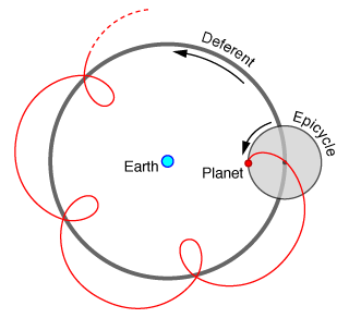
Earlier this week, in a course on ancient astronomy, I was introduced to the concept of “epicycles” and their place in Ptolemy’s geocentric theory. In the domain of astronomy, epicycles are basically orbits on orbits, and you can have epicycles on epicycles, and so on…
For some reason, we as a species were stuck on the idea of having only ideal circles as the paths for planets, not realizing that they could also be ellipses. Oh, and we also thought the Earth was the center of the solar system.
By the time humanity at large switched over to Kepler’s heliocentrism, the leading theory had some 84 epicycles in its full description. As it turns out, “adding epicycles” has since become eponymous with bad science—adding parameters in an attempt to get a fundamentally flawed theory to fit increasingly uncooperative data. Go figure.
While the science behind epicycle astronomy is very much false, they do draw out some frankly beautiful patterns if you follow their orbit. The patterns drawn reminded me of spirographs, and, as far as I can tell, for very good reason. A spirograph is really just a special case of an epicycle path, where the outer orbit perfectly matches up with the inner orbit’s rotation speed

I was then wondering if it was possible to generate spirographs myself to mess around with. It turned out to be fairly straightforward: spirograph patterns are equivalent to a mathematical hypotrochoid with spinner distance equal or less than the inner radius, which is basically the shape you get following a point on a circle rotating inside a larger circle.
Hypotrochoids are even more interesting though, since the spinner distance gets to be greater than the inner rotating circle if you want it to be. In fact, you can even set the radius of the inner rotating circle to be larger than the outer radius that it rotates in, or even negative! This isn’t something you could replicate with a real, physical spirograph, but since it’s just a mathematical model living inside my computer, we can do whatever we want with it.
In total, we have five parameters to work with—inner radius, outer radius, spinner radius, revolutions, and iterations. By messing around with the numbers, I’ve got it to produce some utterly insane graphs. I’d be lying if I said I fully understood the path behind some of these, but I’ll try my best to show and explain what I’ve found, and I’ll later propose a mathematical challenge behind the methods that I’m currently working on.
Anyways, let’s take a look at some spirographs (more accurately, hypotrochoids).
Proof Of Concept
The function for a hypotrochoid is traditionally defined parametrically—in terms of x and y. Python lets us define lambda functions easily to model these like so:
x = lambda d,r,R,theta: (R-r)*np.cos(theta) + d*np.cos(((R-r)/r)*theta)
y = lambda d,r,R,theta: (R-r)*np.sin(theta) - d*np.sin(((R-r)/r)*theta)
Let’s set the theta to be in terms of a more intuitive quantity (revolutions):
revs = 30
Niter = 9999
thetas = np.linspace(0,revs*2*np.pi,num=Niter)
Now, “revs” (revolutions) sets the amount of times the inner circle makes a complete rotation (2 pi radians each), while “Niter” (N iterations) is the amount of points we take along the path drawn (the “resolution” of our graph).
As an initial test, let’s set the relevant variables like so:
d = 5 #Spinner distance from center of smaller circle
r = 3 #Smaller circle radius
R = 20 #Larger circle radius
revs = 6
Niter = 5000

What do we have here? Looks pretty spirography to me.
We can change the amount and size of the “loops” by changing the ratios between the two radii and spinner distance. With different parameters:
d = 3 #Spinner distance from center of smaller circle
r = 2 #Smaller circle radius
R = 5 #Larger circle radius
revs = 6
Niter = 5000

So this is fun and all, but I’ve found that we’re mostly limited to these loopy patterns (I call them “clovers”) if we don’t start messing with the iterations.
Lower the “resolution” of the graph, so we only take points every once in a while, and we can produce much more interesting plots.
d = 5 #Spinner distance from center of smaller circle
r = 3 #Smaller circle radius
R = 20 #Larger circle radius
revs = 200
Niter = 1000

Cool, right? Check this out, though:
d = 5 #Spinner distance from center of smaller circle
r = 3 #Smaller circle radius
R = 20 #Larger circle radius
revs = 200
Niter = 1020

Holy smokes, what happened here?
Keep in mind that the parameters used for this one are nearly identical to the one before it, differing only in iterations (1020 compared to 1000). That means that the only difference between them is a slight difference in angle spacing between the samples.
A small difference makes a big deal when we’re letting the difference fester over a few hundred rotations. Arguably, this makes the system a rather chaotic one.
Here’s a few more examples of the low-resolution regular interval trick making insane graphs:
d = 5 #Spinner distance from center of smaller circle
r = 17 #Smaller circle radius
R = 11 #Larger circle radius
revs = 160
Niter = 500

d = 1 #Spinner distance from center of smaller circle
r = 11 #Smaller circle radius
R = 12 #Larger circle radius
revs = 121
Niter = 500

d = 3 #Spinner distance from center of smaller circle
r = 5 #Smaller circle radius
R = 7 #Larger circle radius
revs = 3598
Niter = 629

d = 3 #Spinner distance from center of smaller circle
r = 5 #Smaller circle radius
R = 7 #Larger circle radius
revs = 3598
Niter = 629
If I were to show every graph that I thought was interesting while messing around with this, this webpage would take a very, very long time to load (I’m probably already pushing it). But feel free to check all of them out in my public document here. It includes many that I didn’t find a place for in this post.
Chaotic Systems
Remember that pair of completely different graphs we made earlier, where the only actual difference between the generation was a slight change in angle spacing between the samples? I actually found a lot of those, and the results are pretty wonderful.
But before we look at a few more examples of graphs changing wildly with small changes to their parameters (in my opinion, the coolest situations), here’s a more generic situation. Basically, I just wanted to point out that, most of the time, small changes can only make… well, small changes. See for yourself:

For reference, the parameters used for those 9 snapshots were:
d = 6 #Spinner distance from center of smaller circle
r = 7 #Smaller circle radius
R = 8 #Larger circle radius
revs = 2000
—where Niter was 452-460. Just take my word for it that this boring sameness happens almost all of the time.
As for the times where it doesn’t happen…
d = 5 #Spinner distance from center of smaller circle
r = 11 #Smaller circle radius
R = 12.6000 #Larger circle radius
revs = 1000
With these parameters, and 200 iterations we get:

Okay, all good. With those same parameters and 201 iterations, we get:

Um, what happened? The simple explanation is that, at 200 divisions of the rotating angle of the inner circle, it happened to be offset slightly, and it created a (relatively) normal spirograph pattern that we’re used to. At 201 divisions though, it just happened to perfectly line up on the same points each time it sampled them around the function. Funky.
Okay, so here’s another, even more insane example. Prepare to have your mind blown.
d = 5 #Spinner distance from center of smaller circle
r = 3 #Smaller circle radius
R = 8 #Larger circle radius
revs = 50050
In the following graphs, the iteration count runs from 997-1003:


Crazy, right? I won’t pretend to know exactly what went down in this example; the extent of my knowledge is pretty much the combination of my earlier explanations on where the “chaos” of this system comes from and how that means that sometimes small changes make immense differences in the final graph.
Extra Graphs
Before we cap things off, I wanted to show off a final few spirographs that I like a lot.
Here’s one that demonstrates how curved lines can be approximated using a series of straight ones:
d = 1 #Spinner distance from center of smaller circle
r = 4 #Smaller circle radius
R = 5 #Larger circle radius
revs = 100
Niter = 325

The dark blue line is the generating function, and the cyan lines are the spirograph that it makes. As discussed earlier, the spirograph is really just a series of points connected from a generating function.
Curiously, it looks like the spirograph itself maps out another generating function, something that could be found under the same set of rules (a mathematical hypotrochoid)! I’ll leave it up to you to figure that one out.
Here’s another:
d = 20 #Spinner distance from center of smaller circle
r = 69 #Smaller circle radius
R = 63.6 #Larger circle radius
revs = 740
Niter = 2030

I called that one “Doom Hands.” Pretty hellish, right?
Okay, last one.:
d = 20 #Spinner distance from center of smaller circle
r = 69 #Smaller circle radius
R = 61.6 #Larger circle radius
revs = 10000
Niter = 10000

I call that one the “Very Filling Donut” because, well, you know.
Final Notes
So first off, I want to say that I did actually show this to the astronomy professor I mentioned at the beginning of my post. He’s an older fellow who mostly teaches required, main-series intro physics courses (read: uninterested engineering students), so I figured I could brighten his day up by showing him that someone made some pretty cool stuff mostly inspired by what he taught.
I showed it to a few other teachers and friends earlier who liked the idea, but without his approval in particular, the whole effort felt almost incomplete. Of course, being the guy that inspired it, I was expecting him to like it the most. I showed it to him with high hopes.
He didn’t seem all that interested. You win some.
Second, if you’re wondering how I created that cool animation at the top, I used Desmos, an online graphing calculator with surprisingly robust animation functions. Here’s the exact notebook I used (complete with a bonus animation!).
Lastly, there’s actually an interesting class of problems that arises from hypotrochoids that I’ve been working on for a while now, and I’ve had a bit of progress. Take a look at this graph:
d = 1 #Spinner distance from center of smaller circle
r = 11 #Smaller circle radius
R = 12 #Larger circle radius
(The exact numbers for revs/iterations aren’t really important if you just want generating functions/plain hypotrochoids—just make them really large relative to the other numbers. See the first two “clover” graphs at the beginning)

Here’s an interesting question: how many closed regions are in that graph? It’s kind of a lot (P.S. I don’t actually know, since counting them seems like a dry exercise, but have at it if you want to kill a few minutes).
I thought the total amount of regions in this graph was an interesting problem, in the sense that trying to figure it out analytically would be a lot of fun. In clear terms, the challenge would be as follows:
Find a function of the three relevant parameters of a hypotrochoid (i.e. inner radius, outer radius, and spinner distance) for the amount of closed regions that its graph will form.
The problem is stated simply but it’s not trivial to solve (at least for me, strictly a non-mathematician). So far, I’ve figured out that the amount of “loops” L (i.e. the amount of revolutions the inner circle performs before it returns to its exact original state) can be consistently found with this formula:

—where r and R are the inner and outer radius, respectively, and lcm() finds the least common multiple of its inputs. For certain ideal situations, the amount of loops or the amount plus one is the same as the amount of closed regions, but most don’t follow that trend. They usually cross over each other (like the situation in the graph above), immensely complicating the problem.
What do you think? Have at it, and tell me how it goes.